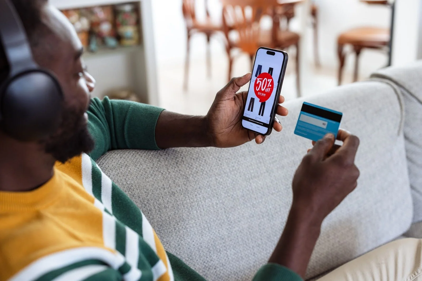
Visuals Make All the Difference: Two Proven Ad Copy Tips to Get More Sales
Are you putting together a digital ad, promotional email, or in-store display for an upcoming sale?
Did you know that the style of the font you use, the color of the text, and even the placement of the discounted price all affect whether or not people click on your ad or enter your store and make a purchase?
Buyer psychology is a field of study that seeks to understand why consumers behave the way they do—including which features within your creative assets will urge them to Buy Now! or pass on the offer.
To increase the number of purchases during your next sale event, try incorporating the following two tips into your promotional copy.
Tip #1: Use right-slanting italics to promote urgency.
Italic is a font style in which the letters appear slanted to the right.
As readers, we have become accustomed to italics being used for emphasis and tone, as well as to denote names and titles. As consumers, we may be less aware of the power of italics to spur our subconscious minds into action.
In this study about the effectiveness of fonts in retail advertising, researchers made a surprising discovery: When paired with a promotional offer, italic text was shown to influence the perception of that offer among consumers, making them more likely to act and ultimately make a purchase.
When italics were used instead of a non-italic font:
3X more consumers clicked on an email link for a gift card promotion
Consumers were 31% more likely to take advantage of a restaurant BOGO deal
Consumers were 42% more likely to feel like they had limited time to act
Why the difference? Italicized text signals urgency, and people feel as though they have less time to take advantage of the deal being offered. This not only makes consumers more prone to take action but increases feelings of potential regret if they do not take action.
It is important to note that the effect was strongest when paired with a specific promotion, when the letters slanted to the right, and among people more sensitive to deals.
Tip #2: Display discounted prices to the right of the regular price.
Sound too simple to be true? It's not.
It's called the subtraction principle, and the simple act of placing the discounted price to the right of the original price makes people 49% more likely to purchase the item on sale. How does it work?
Growing up, we learn the simple basics of math—including the correct way to write out a subtraction equation, with the higher number on the left and the lesser number on the right. For example, 59 - 20 = 39.
It is a simple rule that our brains can follow, and it allows us to quickly compare and identify the smaller number (i.e., the one we would rather pay) in a promotional ad or display.
In series of studies about how consumers perceive sale prices, researchers discovered that when the discounted price appeared to the right of the original price:
Consumers assumed it was a better deal
The product displayed was considered more valuable
Consumers were more likely to purchase the item
Keep in mind, however, that very low or very high discounts, as well as discounts displayed as a percentage (e.g., "Now 25% off!") were not as effective.
Why buyer psychology matters
When you understand why consumers behave the way they do and what advertising features are more likely to motivate your potential customers to act, you can then optimize your creative strategy to better adapt to their wants, needs, and expectations. The result? Higher conversion rates and increased revenue for your business.
Too busy running your business to think about buyer psychology? We can help.
Book your free 30-minute consultation today!


